

Incura
Designing Trust
Scope: Branding & Packaging System
Sector: Biomedical Surgical Solutions
Outcome: Brand Strategy, Brand Visual Identity, and Packaging Architecture
When Incura set out to enter one of the most demanding markets in healthcare - surgical and dental supply- they needed a commendable first impression. The USA-based company manufacturing in Saudi Arabia were entering a competitive B2B landscape where trust is not given, it is earned. We built an entire brand system from the ground up: a company identity, two sub-brand identities, and a complete packaging architecture, designed to launch Incura into the market with the confidence of an established name.

Brand Strategy
Incura's core challenge was credibility. In medical supply, buyers are not consumers; they are surgeons, procurement officers, and clinic directors who make decisions under pressure and cannot afford to be wrong. The brand needed to feel immediately trustworthy: minimal, memorable, and authoritative without being cold.
Our strategy was to position Incura not as a newcomer, but as a company that had already earned its place in the room. Every decision - from naming architecture to colour system- was made in service of that single objective: confident market entry.
Design Approach to Branding
For the Incura master brand, we designed a clean, sleek logotype built for recognition and longevity. No embellishment, no metaphor. A mark that communicates precision and stability at a glance.
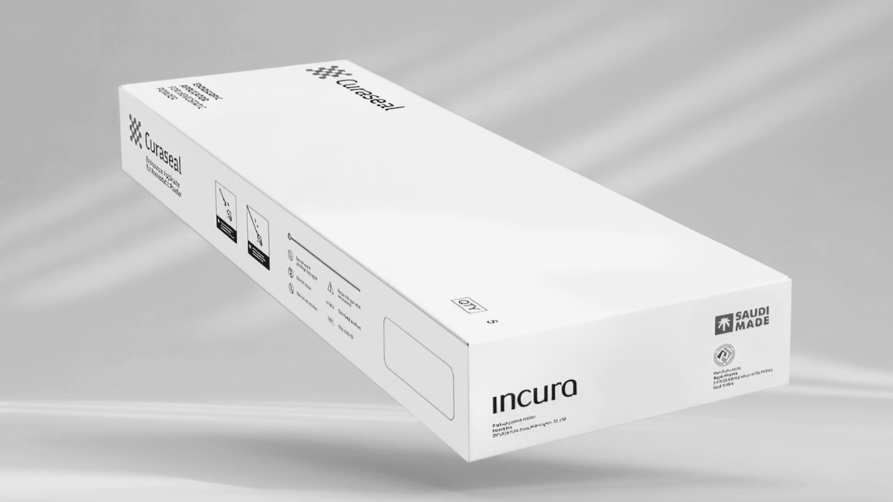
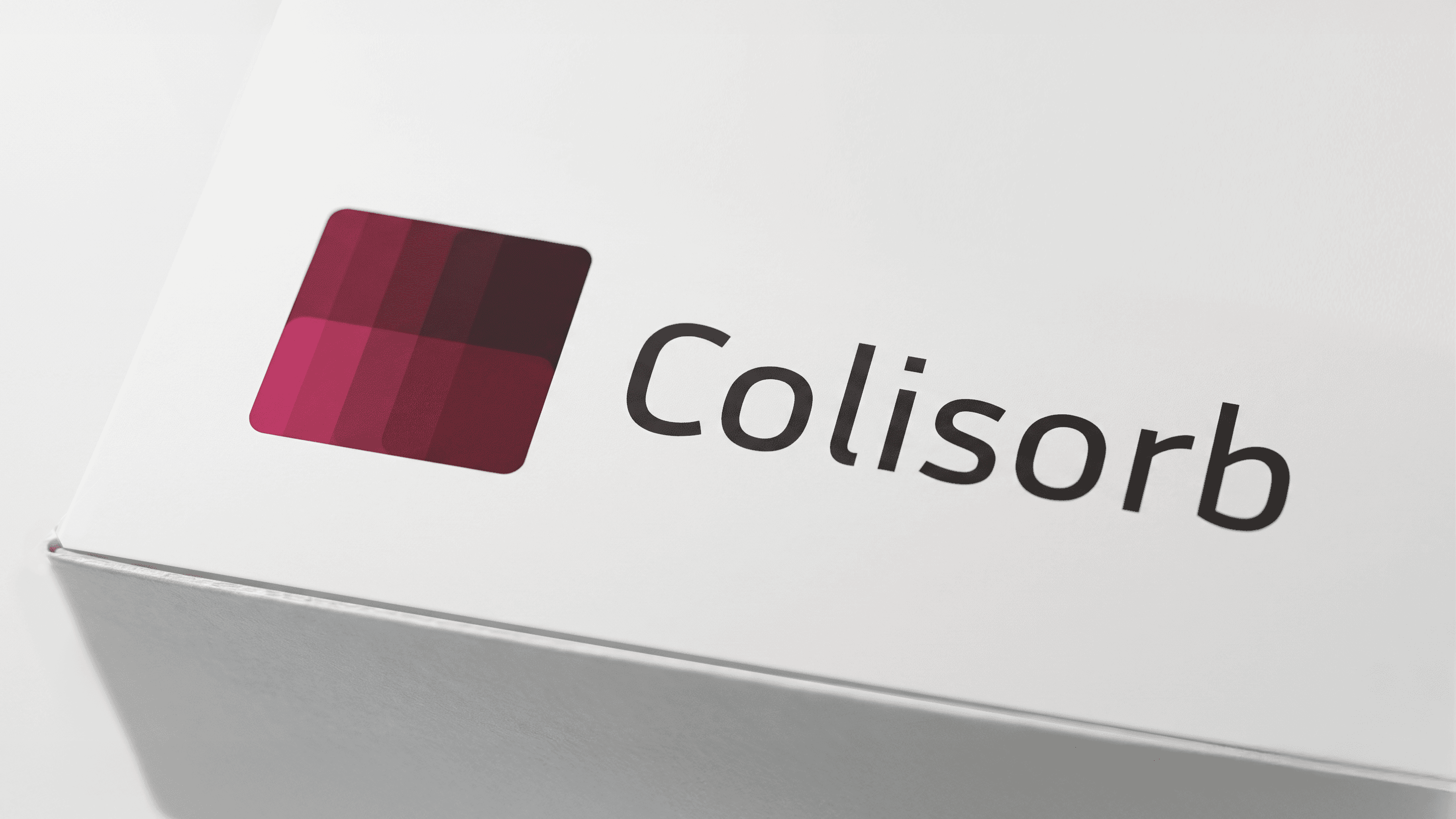
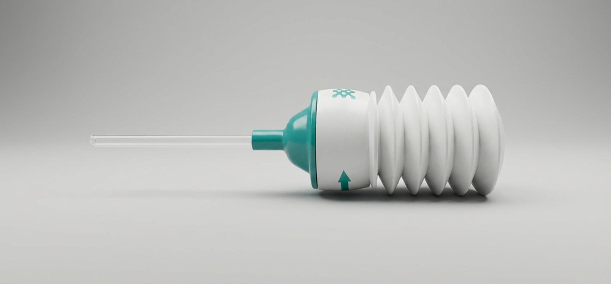
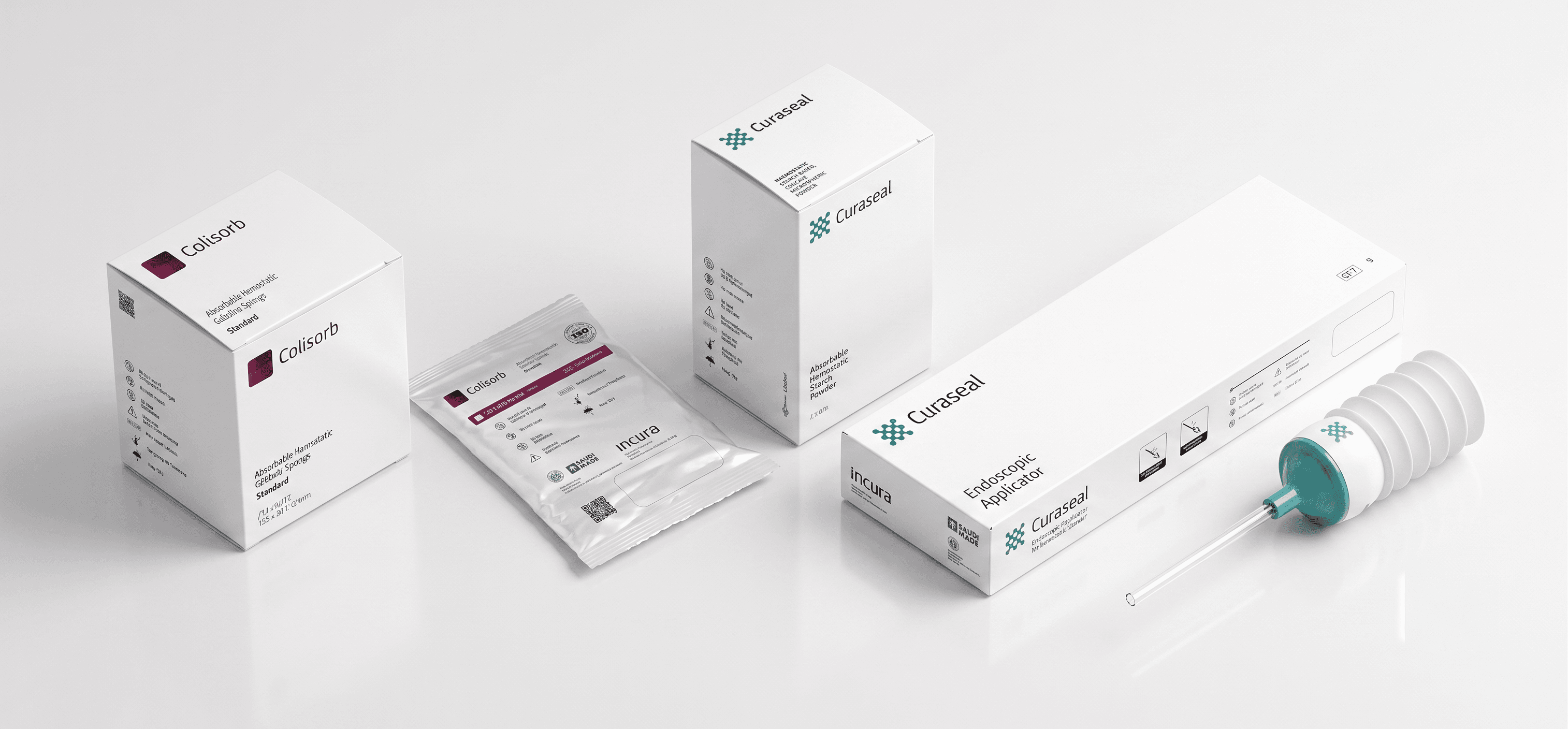
For the two product lines, Curaseal; Absorbable Hemostatic Starch Powder, and Colisorb and Collident; Absorbable Hemostatic Gelatine Sponge, we developed distinct logo icons drawn directly from the functional logic of each category. Each icon is a visual translation of what the product does, thus grounding the sub-brand in purpose. The logotypes for both product lines were designed to match the Incura master brand, creating a cohesive family system that reinforces brand recognition across all touchpoints.
Design Approach to Packaging
In the medical sector, packaging is not decoration! It is the first act of communication between a product and the professional who will use it.
For Incura, that communication had to work under the most demanding conditions: a surgical room mid-procedure, a dental clinic between appointments, a procurement decision made in seconds. Clarity was not a design preference. It was a clinical requirement.
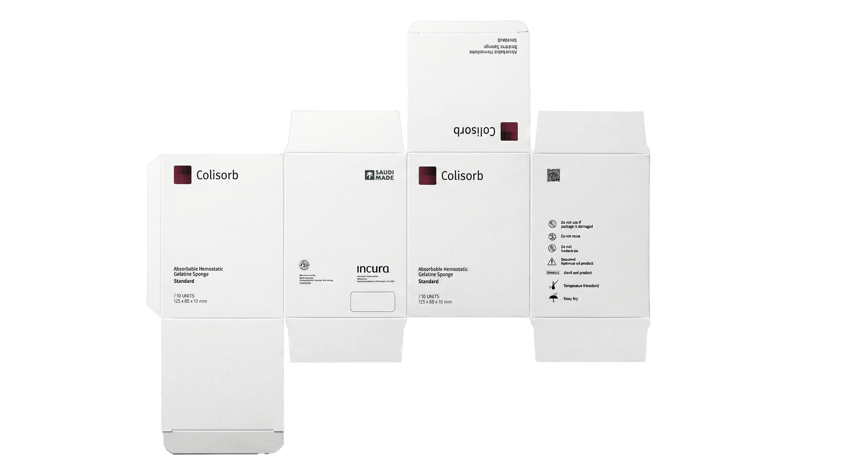
We built an intuitive packaging architecture with a visual hierarchy that communicates directions of use and storage at a glance, guiding the user through the product without demanding their full attention. Every typographic choice, every colour decision, and every structural element was made in service of a single objective: to make the person holding the product feel confident. In a highly regulated, crowded market, that confidence is not a feature. It is the brand's most important asset.